The Brief
Milo came to us wanting a new super easy to use website, from both the clients perspective and his own.
Critical to him were good visuals, easy to read, short text and a website that is easy to navigate. He also wanted to be able to easily change content and add new courses.
Our Solution
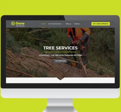
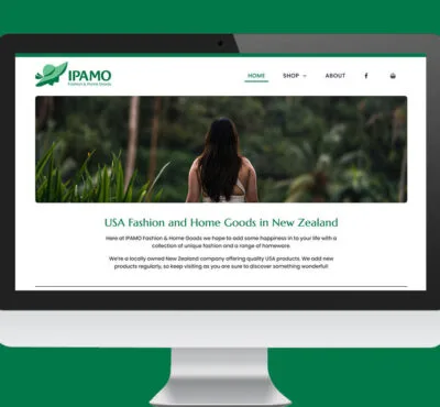
A bold web site design with nice, large readable fonts, bite size chunks of text, and strong headings.
Coupled with careful use and choice of images and clear calls to action.
All built as a responsive web design around WordPress.
… take a look.


Comments (0)